Chronomics Analysis Toolkit
Home
Citing this site
Reference Material
Contact Us
Analysis Techniques
Actogram
Smoothing
Autocorrelation
Crosscorrelation
Cosinor
Distributions
Running CAT
Running CAT Cosinor
>
Interpreting CATCall
Data Formats
Errors
Running CAT PMC
Running CAT PMCTest
Installation
Installing R
Installing CAT
>
Version Archive
Vignettes
Sample Output
CAT Output
Cosinor Output
Data
MBS Supplemental Materials
Supplemental
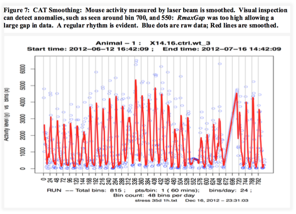
Smoothing
More examples of CAT output can be seen in the Supplemental Materials.
Visualization of the Signal:
It is important to assess the quality of the data, and consider if modifications are needed before performing quantitative analysis. Missing data, trend lines, or unexpected behaviors might be observed, prompting further inspection or data con
-
ditioning such as detrending or interpolation. Inspecting Figure 7, for example, a long sloped line spanning two days (from about 672 - 720) can be seen where there was a large gap of missing data, filled by linear interpolation. For visualization purposes, the CAT Smoothing function plots a moving average, which cleans up the signal, allowing the rhythm to be observed more clearly. An alternate handling my be desired here. CAT smooths the data by averaging the K nearest data points on either side of every data point (such that 2K+1 data points are averaged), and that average becomes the new point. The default is K=6 for the CAT smoothing function, and can be set by parameter specified at run time.